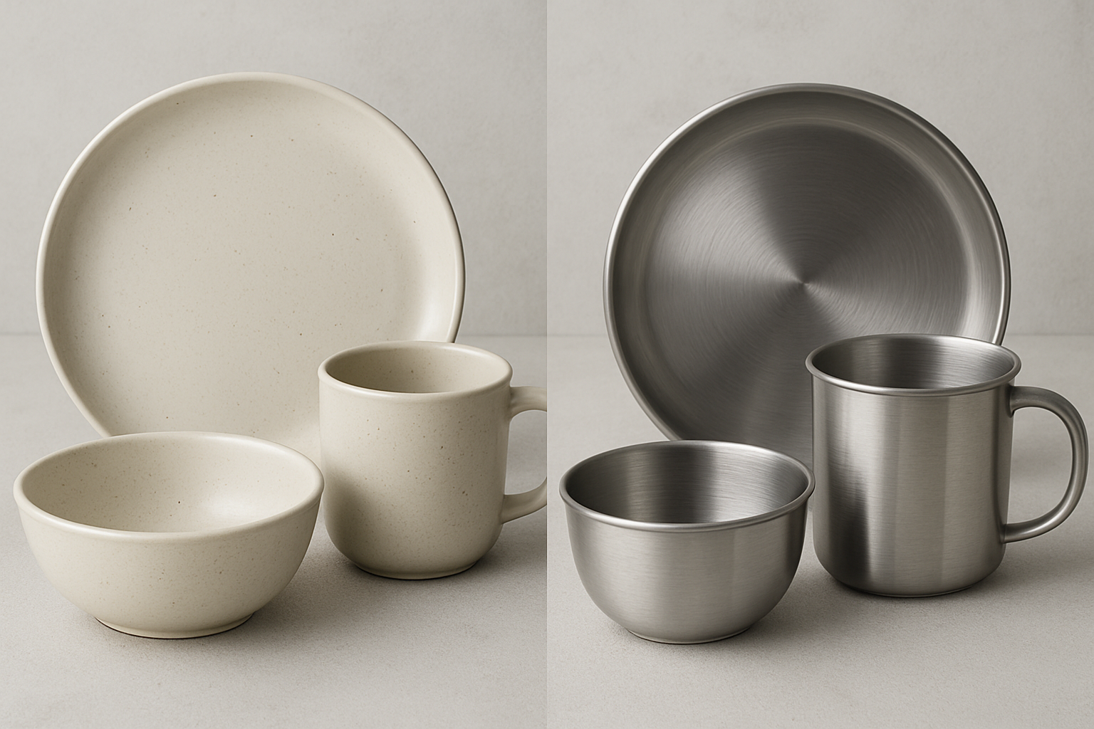
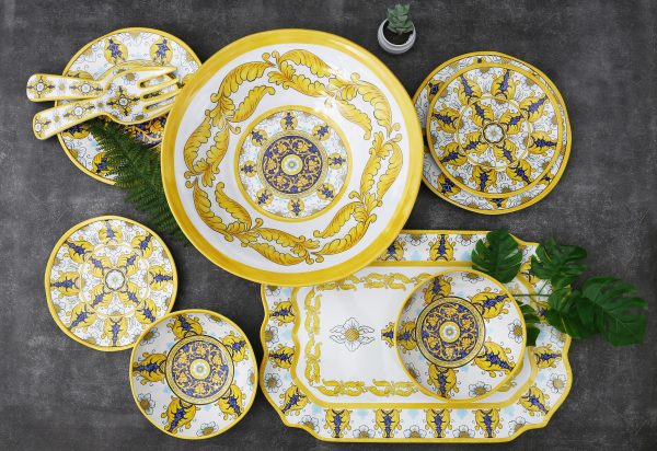
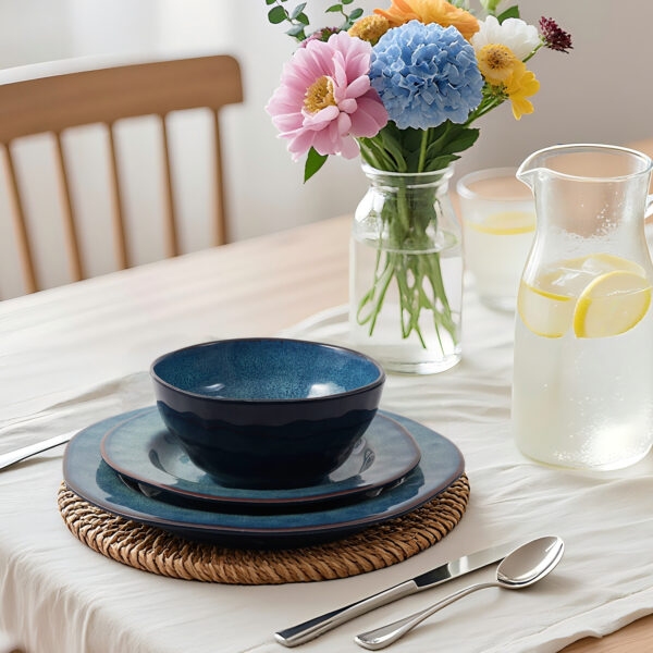
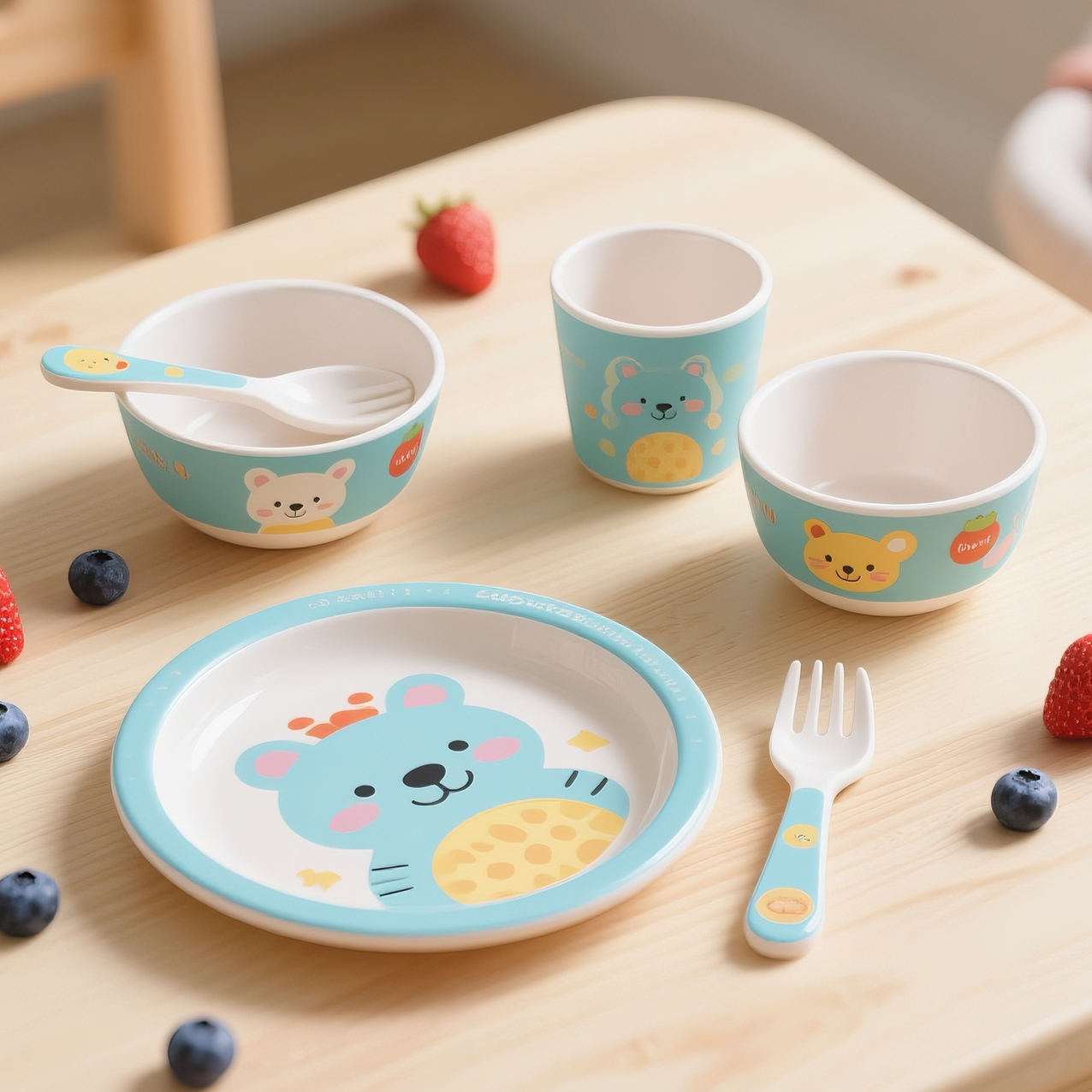
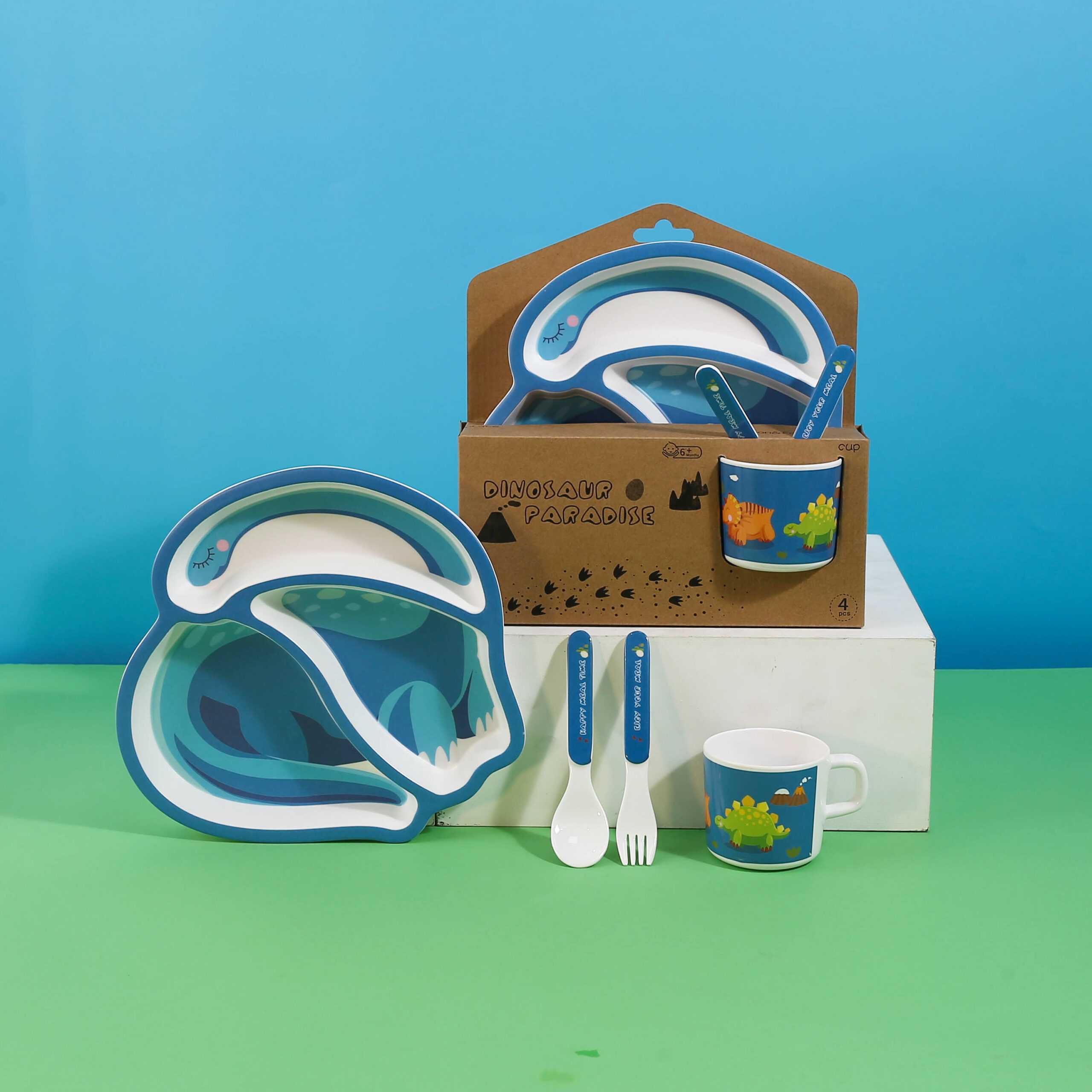
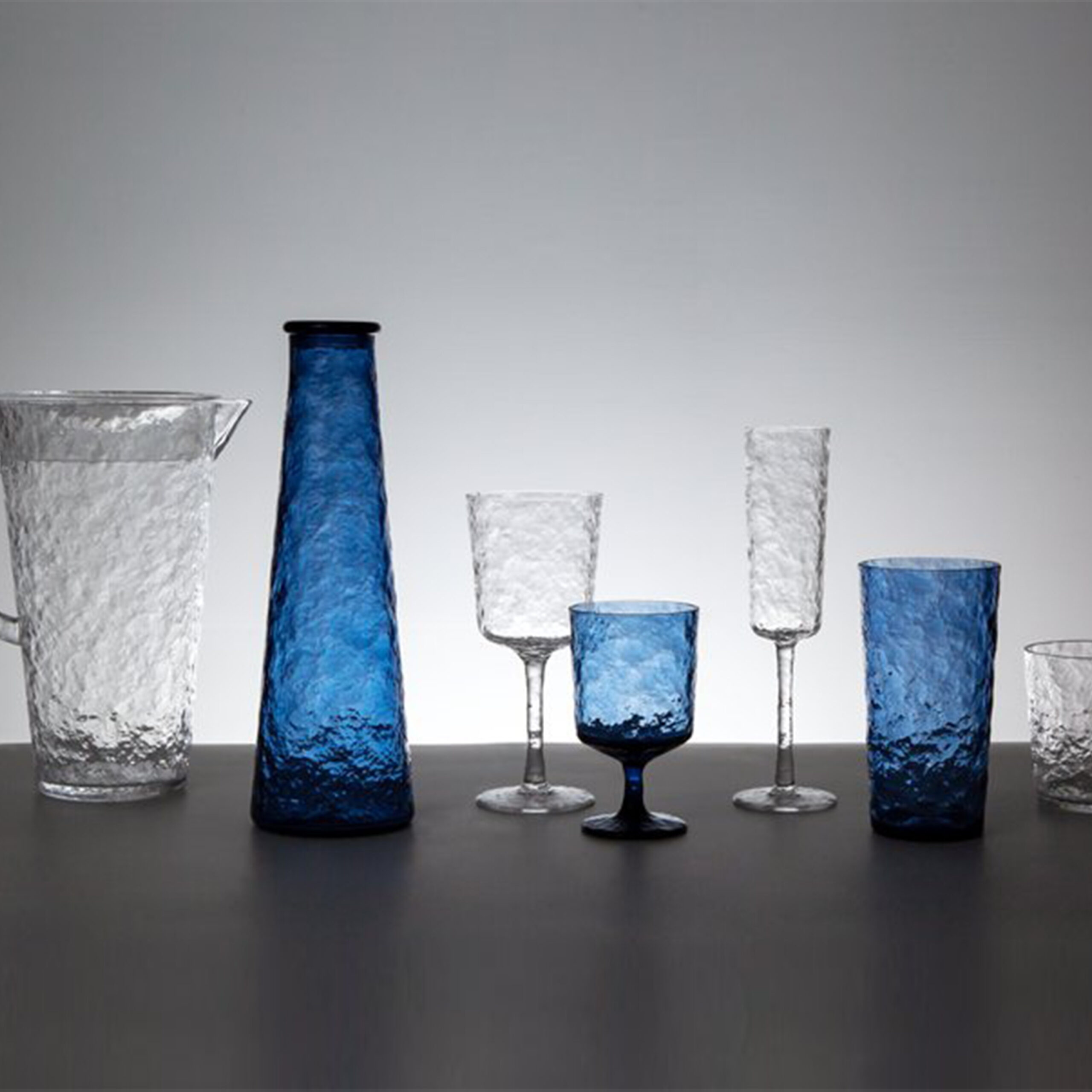
Color matching & food presentation is an art. Many customers often want to use colorful tableware to attract customers and present delicious food.
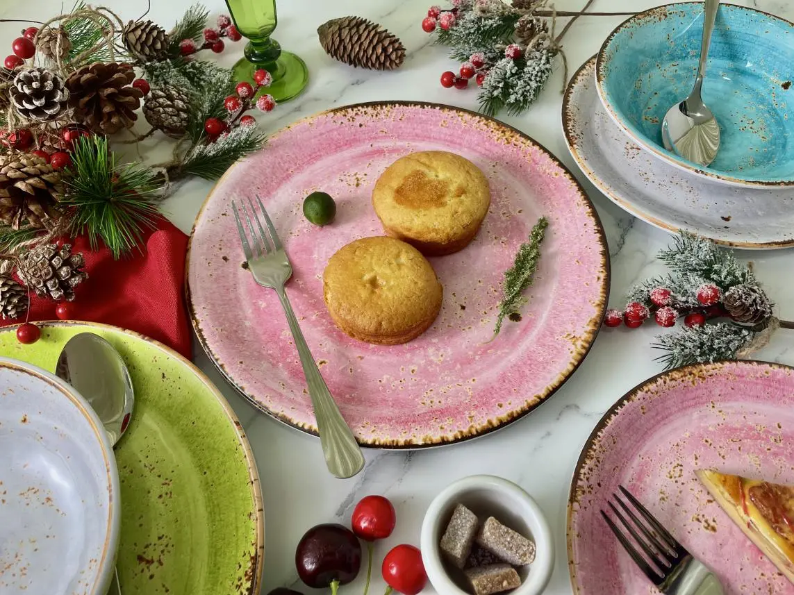
We all know one thing, your location and the visual appearance of your food are the first and most lasting impressions your dining guests notice. If the food doesn’t look good, our brain’s natural reaction is to tell us that we shouldn’t eat it, or that it’s not what we expected. Conversely, if the presentation of the food looks good, our brains lead us to believe that it tastes as good as it looks, putting us in a state of excitement!
While the color of the food itself is important, so is the color of the plate, which affects how we perceive our meals. Customer satisfaction starts with sight, after all, humans are visual creatures. I saw an experiment online that proved the importance of tableware vision. Creating customer satisfaction is more than just serving a great meal, all of our senses influence how we perceive food. Our perception begins with sight and is influenced by all sensory attributes such as smell, touch, texture and taste, so it is part of the overall presentation of a culinary creation. So, in this article, we’ll look at how different colors affect the appearance of food, and how to best complement your dishes with color to keep your restaurant busy.
How to choose the color of the plate to achieve the best marketing effect:
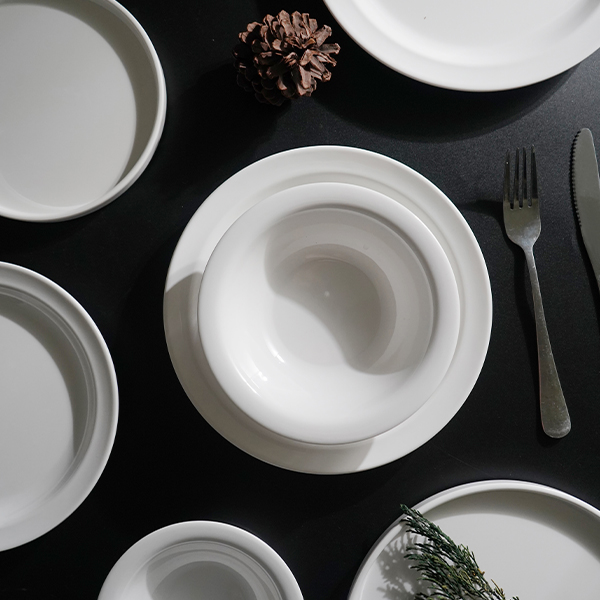
White tableware with textures or different shapes
White is the color of choice for many chefs when making culinary creations, Because white as a background color can set off and any food will look good when placed on it, making the color of the food look brighter and more attractive.
However, white tableware can also be boring and lack innovation. Food presentation using whiteware in different shapes or textures can help enhance the presentation and stimulate new senses.
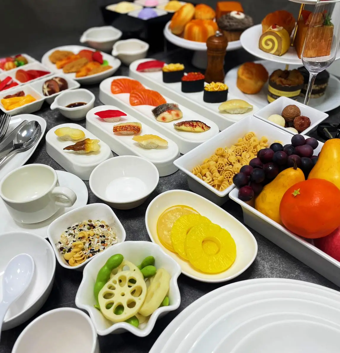
The color of the tableware and the color of the food complement each other
In fact, many culinary professionals are now opting for colorful tableware to add extra pizzazz to their tabletop meals. Some people mix several different colors on the same tabletop, and even mixing different textures and materials is becoming increasingly accepted in the food service industry.
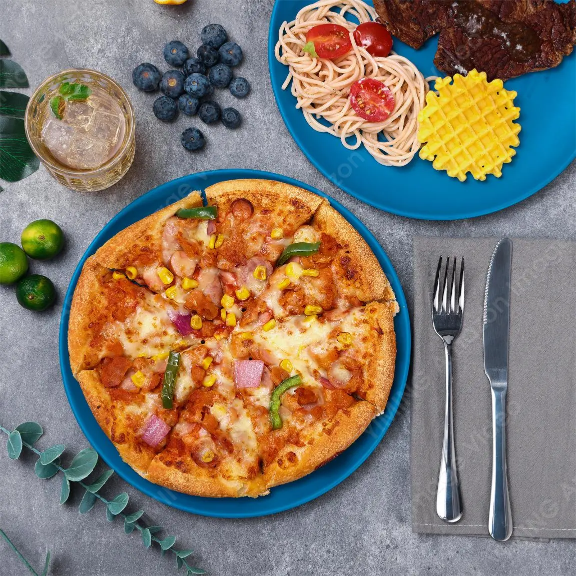
Of course, if you want to be memorable and increase repeat business, the color of your dinnerware can help you stand out in your industry. The key is that you choose creations that support and highlight your food rather than overpowering/detracting from your food presentation.
To create harmony between the colors of food and tableware, stick to colors that touch each other on the color wheel. In other words, the colors on both sides of the color wheel (i.e. red and green, orange and blue, yellow and purple) are complementary colors, not contrasting colors. At the same time, these colors not only complement each other but also enhance or emphasize each other by creating contrast.
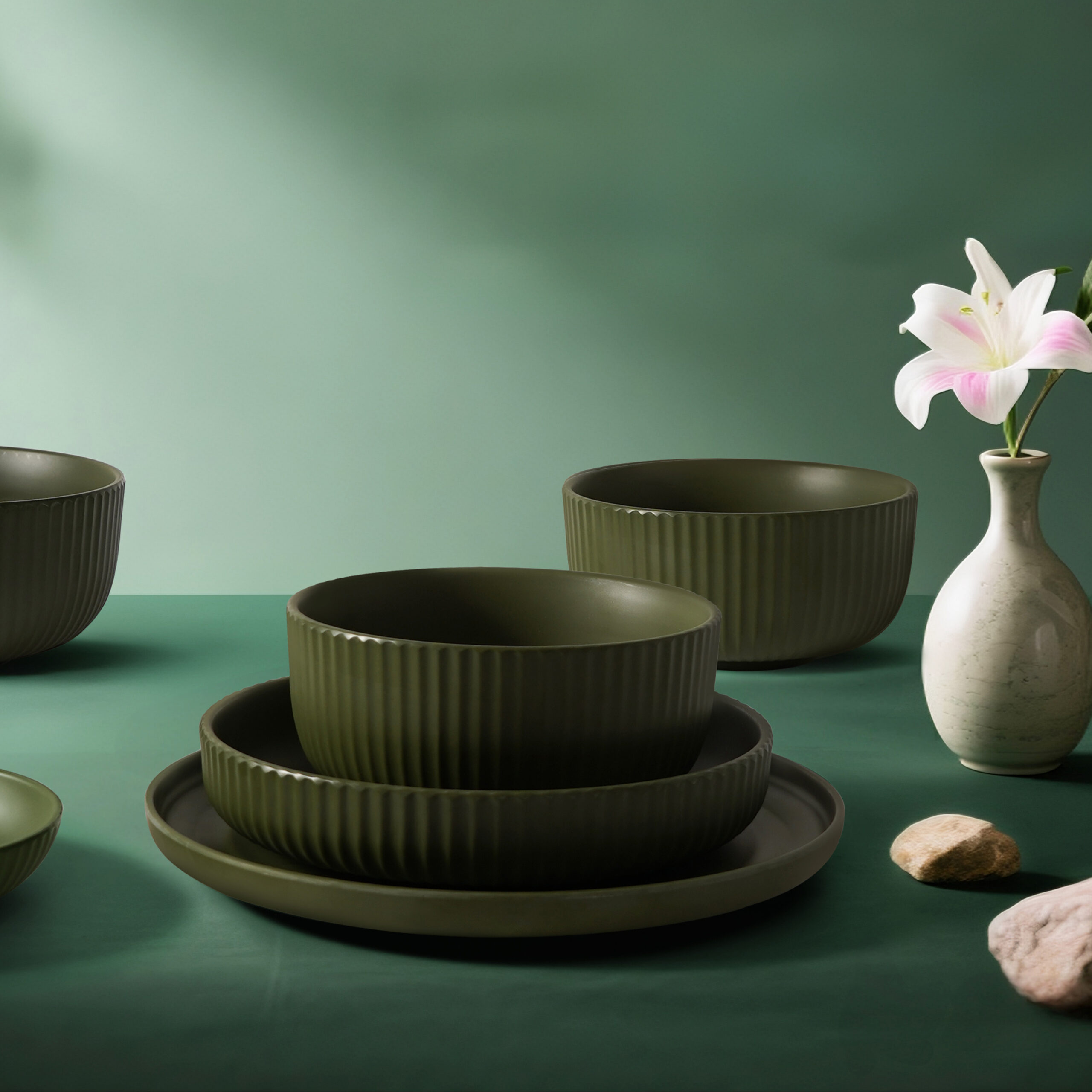
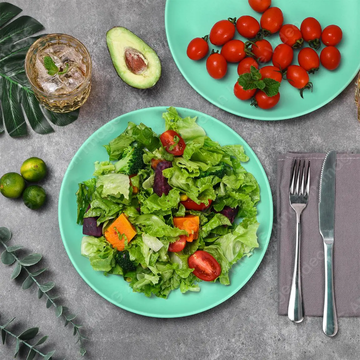
For example, when you’re serving meatballs in red sauce, don’t be afraid to opt for greenware because a green salad in a red bowl will attract the attention of your guests and create a more intense appearance.
The law of matching different colors of food with different colors
We can connect colors to emotions and feelings, making food more than just food but healing medicine for our clients. For example, gold, maroon, and brown give people a feeling of comfort, richness, and warmth; green vegetables are full of vitality and freshness; red and orange are powerful and intense.
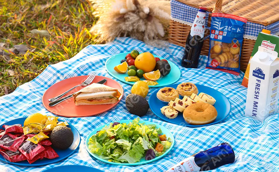
I have compiled some color food matching methods for your reference:
Beige or neutral foods: chicken, potatoes, creamy pasta…
Since these items can easily appear bland, bring contrast to your presentation while maintaining the same temperature tone (i.e. cool or warm). Therefore, black or brown will provide the perfect contrast while maintaining the same warm tone.
Red: Beef, tomato sauce or red sauce, tomatoes, beets…
Red is a striking color that comes in many shades. Red can also be a warm and cool color. Because of this, white is the perfect choice for your creative frames, or you can place it on a green background for a more vivid look.
Orange and yellow: curries, eggs, corn…
Both are warm colors, and contrasting colors at the same temperature can add drama. Bright warm blues are good for both yellows and oranges. Just make sure the temperature tone stays warm. It should be noted that cold blue may cause disharmony, so avoid matching this color as much as possible.
Greens: pesto, salads, guacamole…
Green is a combination of yellow and blue. Since yellow and green are both warm tones and share the same pigment, they work well together to keep the freshness of your food balanced.
In general, everything starts with the menu and tone you want to achieve. Different colors will collide with different effects and chemical reactions, so there is no fixed law, only different beauty!


